Tag Archives: paint color consultations

Which COLOR PAINT can help you to LOOSE WEIGHT?

ORANGE evokes excitement, enthusiasm and is an energetic color. While not a good idea for a living room or for bedrooms this color is great for an EXERCISE ROOM. It will bring all the emotions out that you need when JUMPING INTO YOUR FITNESS ROUTINE.


Photobucket
Why YOU can’t afford NOT to have a CUSTOM COLOR CONSULTATION?

Most color consultations can be completed within an hour or two at the most. How much can just a gallon or two of the wrong custom color paint set you back, a couple days of a painting contractors’ time or how about if your choose a color that will make you relax when you’re supposed to be working out? Choosing the best colors for your home the first time around can literally save you hundreds of dollars in the long run and you can’t beat having a design professional who can walk you through the process of creating your unique vision for your home.

Whether you’re looking to PAINT your HOME GYM and any room(s) in your home Jill at Changing Spaces will bring her YEARS of experience in RE-design and professional paint color expertise to help you pick the RIGHT PAINT COLORS for your home. Jill will come to your home with a professional paint kit and an expert eye. Together we will choose the best colors and finish for your home based on your lighting, furnishings, personal style and exercise needs.

Changing Spaces by Jill Denton ~ Interior RE-Design, Color Consultations and Staging
925.998.7747

Please visit our website for more before and after photos and more information:www.jilldenton.com

Services offered: Full day Interior RE-Design, Half day Interior RE-Design, One Room Interior RE-Design, RE-Design consultations, Interior and Exterior Custom Paint Color Consultations, Staging Consultations and Home Staging.

Photobucket

Which PAINT COLOR can LOWER your BLOOD PRESSURE?

Did you know, BLUE brings down blood pressure and slows respiration and heart rate. That’s why it’s considered calming, relaxing, and serene, and is often recommended for bedrooms and bathrooms. Be careful, however: A pastel blue that looks pretty on the paint chip can come across as unpleasantly chilly when it’s on the walls and furnishings, especially in a room that receives little natural light. If you opt for a light blue as the primary color in a room, balance it with warm hues in the furnishings and fabrics.

Photobucket

Why YOU can’t afford NOT to have a CUSTOM COLOR CONSULTATON?

Most color consultations can be completed within an hour or two at the most. How much can just a gallon or two of the wrong custom color paint set you back, a couple days of a painting contractors’ time or how about if your coose a color that will make you relax when you’re suposed to be working out? Choosing the best colors for your home the first time around can literally save you hundreds of dollars in the long run and you can’t beat having a design professional who can walk you through the process of creating your unique vision for your home.

Whether you’re looking to  RE- paint one or all of the rooms in your home Jill at Changing Spaces will bring her YEARS of experience in RE-design and professional paint color expertise to help you pick the RIGHT PAINT COLORS for your home. Jill will come to your home with a professional paint kit and an expert eye. Together we will choose the best colors and finish for your home based on your lighting, furnishings, personal style and exercise needs.

Changing Spaces by Jill Denton ~ Interior RE-Design, Color Consultations and Staging.

925.998.7747

Please visit our website for more before and after photos and more information:www.jilldenton.com

Services offered: Full day Interior RE-Design, Half day Interior RE-Design, One Room Interior RE-Design, RE-Design consultations, Interior and Exterior Custom Paint Color Consultations, Staging Consultations and Home Staging.

Photobucket

Which COLOR PAINT makes BABIES CRY more?

YELLOW! It’s true, babies seem to cry more in a yellow room … and people are more likely to lose their tempers in a yellow room; therefore, the color yellow is NOT a good choice for a main color scheme. Although, yellow can work in kitchens, dining rooms, and bathrooms, where happy color is energizing and uplifting.

Photobucket

Whether you’re looking to  RE- paint your BABIES ROOM and/or any room(s) in your home Jill at Changing Spaces will bring her YEARS of experience in RE-design and professional paint color expertise to help you pick the RIGHT PAINT COLORS for your home. Jill will come to your home with a professional paint kit and an expert eye. Together we will choose the best colors and finish for your home based on your lighting, furnishings, personal style and exercise needs.

Why YOU can’t afford NOT to have a CUSTOM COLOR CONSULTATiON?

Most color consultations can be completed within an hour or two at the most. How much can just a gallon or two of the wrong custom color paint set you back, a couple days of a painting contractors’ time or how about if your choose a color that makes your baby cry more? Choosing the best colors for your home the first time around can literally save you hundreds of dollars in the long run and you can’t beat having a design professional who can walk you through the process of creating your unique vision for your home.

Changing Spaces by Jill Denton ~ Interior RE-Design, Color Consultations and Staging
925.998.7747

Please visit our website for more before and after photos and more information:www.jilldenton.com

Services offered: Full day Interior RE-Design, Half day Interior RE-Design, One Room Interior RE-Design, RE-Design consultations, Interior and Exterior Custom Paint Color Consultations, Staging Consultations and Home Staging.

Photobucket

COLOR CONSULTATIONS! Help Selecting Interior or Exterior Paint Colors

 paint swatches

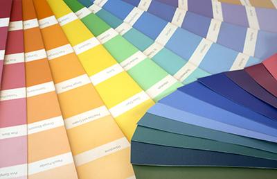
Selecting the right paint color is a daunting task for most.  Here are two ways to get the job done.

Option 1: 

  1. Do it yourself.
  2. Try to narrow done your basic color desire down to one or two basic colors (blue, green, red, yellow).
  3. Go to one or all of your local paint stores and gather up samples. This can be the hard part, because the lighting in the paint store is different than in your home.  When you select a color that you like at the store, chances are it will look different at home.  So, get A LOT of samples.
  4. During daylight, look at the paint swatches in on each wall of the room.  Depending on lighting, it can look different on each wall.  If you’d like, you can look at them again at night.
  5. Hopefully, a couple of the colors will  look good to you. If yes, I would suggest you go back to the paint store(s) and get a few more swatches of the same color, if possible – order large swatches, or get a sample of the paint to test.  If you decide to get a sample of the paint, you have three choices.  1.  Paint it right on the wall (be sure to do a swatch on each wall – lighting again), 2.  Get a piece of poster sized wall board from your local box store and paint it – then you can move it around the room with out having to paint swatches all over your walls, 3. Most box stores now carry designer sample boards, they are about the size of a piece of paper.  Get 4 and paint all of them and place on each wall. Do this for all colors you are considering.
  6. Hopefully, you’ll love one of the colors.  If so start painting!
  7. If not, go back to step 2 and do it all over again … and again … (if necessary) until you find the perfect color for you.

Option 2:

1.  Hire a professional and get a Color Consultation.  Someone like myself will come to your home and bring all the swatches to you.  I typically carry ALL the swatches for 2-3 different brands of paint.  Depending on how many rooms and how many colors you select, it can take as little as 1 hour, most take 2-3 hours … and you’re ready to start painting immediately!

If you’re located in the San Francisco Bay Area, contact me for more information about getting a color consultation.  If you’re elsewhere, contact me anyway – I can probably refer you to someone.

Jill Denton ~ Changing Spaces

Paint Color Trends 2008 – Sherwin Williams

Sherwin Williams Color Themes for 2008:

“Around the World” color palette has influences from Latin America, the Middle East, Eastern Europe and From Russia.

Relic Bronze SW 6132

Relic Bronze SW 6132
Tassel SW 6369
Tassel SW 6369
Borscht SW 7578
Borscht SW 7578
Dynamo SW 6841
Dynamo SW 6841
Feverish Pink SW 6859
Majestic Purple SW 6545


“Departure Colors” have influences Ethnic-influenced hues that now feel familiar and continue to resonate.

Cocoon SW 6173
Cocoon SW 6173
Plum Brown SW 6272
Plum Brown SW 6272
Red Cent SW 6341
Red Cent SW 6341
Crabby Apple SW 7592
Ceremonial Gold SW 6382
Tupelo Tree SW 6417
Tupelo Tree SW 6417


“Expand Your Horizons” makes an effort to balance out the grays of technology that permeate our daily living spaces.

Cayenne SW 6881

Cayenne SW 6881
Iron Ore SW 7069
Iron Ore SW 7069
Tatami Tan SW 6116
Tatami Tan SW 6116
Wood Violet SW 6557
Wood Violet SW 6557
Marquis Orange SW 6650
Aquarium SW 6767
Aquarium SW 6767


“Fork in the Road” is an energetic palette, with elegant touches.

The Road Less Traveled

Real Red SW 6868
Real Red SW 6868
Fountain SW 6787
Fountain SW 6787
Gladiola SW 6875
Gladiola SW 6875
Quilt Gold SW 6696
Quilt Gold SW 6696
Organic Green SW 6732


The Road Well Traveled

Liberty Blue SW 2942
Gecko SW 6719
Gecko SW 6719
Frank Blue SW 6967
Frank Blue SW 6967
Ash Violet SW 6549
Ash Violet SW 6549
Blackberry SW 7577
Blackberry SW 7577

“No Place Like Home” color palette is retro-minded.  Use a 2008 paint color from this palette to select a neutral.

Twinkle SW 7135
Twinkle SW 7135
Evening Shadow SW 7662
Mountain Air SW 6224
Restful White SW 7563
Gorgeous White SW 6049
Fleur De Sel SW 7666


Grounded Colors

Pink Shadow SW 0070

Pink Shadow SW 0070
Bateau Brown SW 6033
Agate Green SW 7742
Agate Green SW 7742
Classic Sand SW 0056
Granite Peak SW 6250

“Pack Your Bags” are bold colors that can visually take you around the globe.

Gateway No. 1 A New England road trip, from Connecticut to Maine.

Real Red SW 6868
Real Red SW 6868
Cocoon SW 6173
Cocoon SW 6173
Tatami Tan SW 6116
Tatami Tan SW 6116
Restful White SW 7563
Blackberry SW 7577
Blackberry SW 7577
Granite Peak SW 6250
Liberty Blue SW 2942


Gateway No. 2 A desert escape, sun and scrubby brush, bleached-out stone and wood.

Tupelo Tree SW 6417
Tupelo Tree SW 6417
Marquis Orange SW 6650
Twinkle SW 7135
Twinkle SW 7135
Evening Shadow SW 7662
Iron Ore SW 7069
Iron Ore SW 7069
Plum Brown SW 6272
Plum Brown SW 6272
Ash Violet SW 6549
Ash Violet SW 6549

Due to individual computer monitor limitations, colors seen here may not accurately reflect Sherwin-Williams paint colors. To confirm your color choices, visit your neighborhood Sherwin-Williams store and refer to our in-store color cards.

Source: Sherwin-Williams, http://www.sherwin-williams.com

 If this is way too many choices or just plain overwheleming to you, call me for a color consultation!

Jill Denton ~ Changing Spaces

jill.jpg

Paint Color Consultations

Color is one HOT topic! 

paint.jpg

Everyone wants to know what color(s) to paint inside their home.  You can look at color trends and find colors that you are drawn to, but please understand that lighting is key.  Just because it’s on the hot list for colors in 2008 doesn’t mean it’ll look hot in your home.  You still have to do the work.  You can select a basic color from the 2008 trends then either hire someone to do a color consultation or do the leg work yourself and go get similar color swatches from one or two paint stores.  You’ll find that some look to bright, some to dull, some will look dirty and some will have a underling shade of green, pink, yellow…

You’ll also need to keep in mind existing colors that will stay in the room.  Make sure the paint color you select coordinates with the flooring, cabinets, wood work and any fabrics that will also be in the room.

When I do a paint color consultation I typically start with Kelly Moore paint.  I have used Kelly Moore for so long that I know most of the colors very well, and I find that there are a few shades of yellow, green, blue and red that are very appealing to most people.  However, once in a while those same popular colors will look terrible in some homes.  Why?  The lighting.  Natural lighting will bring out different undertones.  Whether there’s a lot of natural light or not enough.

It’s really not that hard to find paint colors that you like.  The hard part is making the decision which one will look best in a room(s) of your home.  If you’re painting yourself, go ahead and paint a wall.  What’s the worst thing that can happen? You won’t like the color and have to buy  eand paint it again.  If you’re paying a professional painter to paint, you might want to spend a few more dollars and get a professional color consultation.  You’ll be glad you did!

Jill Denton

Changing Spaces ~ Color Consultations