Category Archives: Interior Design

Do You Have Good Traffic Flow Inside Your Home?

yeild to traffic flow 

One crucial part of design is traffic flow.  A room not only needs to look good, but it needs to have good traffic flow. 

Have you ever stepped into a room only to be blocked by a piece of furniture.  Not too long ago I went to a friends home.  It’s decorated very Pottery Barn style.  From the entry, you walk down a hallway to the family room where you run right into the back of an overstuffed chair.  I literally had to side step around the chair to get into the room.  While I did a little dance around the chair my mind began rearranging or “Interior Redesigning” the room.  Overall the room was laid out well.  It was just the one overstuffed chair that created a problem. 

Click on the “Good Traffic Flow” link below and you’ll see two sample layouts but first, let me explain.  The top layout is BEFORE, and you can see the open doorway that leads you into the chair and a round ottoman in another corner.  In the AFTER layout, you’ll see that by just switching the over-sized chair with the ottoman, the flow into the room has greatly improved.  One thing you can not see on the layout is the difference in height of the chair and ottoman.  Where the back of the chair visually blocked the entry, the ottoman visually lets you enter the room.  Good Traffic Flow

Traffic flow is essential for comfortable living; as well as, comfortable viewing for those of you who are planning on selling your home.  Dana Dickey says: “Control the flow! If you have a problem with traffic flow, bump into things and do not like the way your rooms feel, then a potential buyer will FEEL the same thing. Proper placement of furniture is essential when buyers are looking at square footage. Remember why you bought the house and try to change what doesn’t work.” Source: Inside Redesign LLC

How about you?  Do you have any traffic flow problems in your home?

Jill  Denton ~ Changing Spaces

Top 5 Reasons to Get an Interior Redesign:

5.  Interior Redesign fits any budget. 

4.   Interior Redesign works for any style.

3.  Interior Redesign gives a designer look to any room.

2.  Interior Redesign uses what you already own and love.

1.  An Interior Redesign  is completed in just ONE DAY!

interior redesign

Contact Jill Denton at Changing Spaces for more information about getting an Interior Redesign for one room your your entire home.

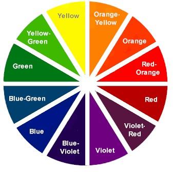
The Color Wheel

color-wheel.jpg 

Complementary: This scheme uses two colors which are directly opposed on the color wheel (for example: Orange and Blue)  

Split Complementary: This scheme uses 3 colors. One color and two other colors that are directly adjacent to its complement on the color wheel (for example: Orange, Blue-Violet, and Blue-Green)  

Triad: This color scheme uses 3 colors that are equally spaced out on the color wheel (for example: Orange, Violet, and Green)  

Analogous: This scheme uses three colors, one that is in the center, and the two colors adjacent to it on the color wheel (for example: Orange-Yellow, Orange, and Red-Orange).

Monochromatic: This color scheme uses colors from the same Hue on the color wheel, but with varying saturation and/or lightness (for example: different shades or tints of Orange).  Jill Denton ~ Changing Spaces

3 Steps to Choosing Paint Color

Choosing a paint color can be one of the most difficult decorating decisions, there are so many choices out there, but with a few designer tips, it can be as easy as 1-2-3.

color-wheel.jpg

1. Pick your favorite object in the room. This can be a rug, fabric, wall art, comforter or piece of furniture. The color(s) of this object will set the mood and overall look for the room.

2. Select colors that go with the favorite object you selected. In a rug, a piece of fabric or wall art, coordinating colors will be easy to spot.  Just match one of the colors that you like.  Or you could choose an analogous, complementary, split complementary, triad or monochomatic color scheme based on the color wheel. For example, if your sofa is blue and you added analogous colors, you’d be adding other shades of blue, if you were to add shades of orange you’d be adding a complementary colors.

3. Choose accents to pull the room together.  For most people, this is either the fun part or the hard part.  Look to the color wheel for direction if you need help.  The same rules apply.  Choose accent peices, furniture, window treatments, art and accessories that are coordinating, analogous or complementary ito complete the room.

Decorating Trends for 2008 II

Beams are back!  Remember those dark brownish black beams from the 70’s?  In the late 80’s and 90’s everyone painted their beams white to make them disapear into their ceilings.  Well, guess what?  It’s time to make them look like what they are – a beam.  Okay, so the color they used in the 70’s is very dated and we don’t want to recreate that look, but we do want a beam to look like a beam.  Why?  Because it is a architectual element that adds interest and appeal to your space.

beams

Nowadays, you’ll find beautiful beamed ceilings in new custom homes and beautifully restored beamed in vintage homes.  It’s the homes in between that need some love.  Here are a few easy solutions.  1. Paint the exisiting beam brown.  It could be as easy as selecting the right color, or take it to the next step and add some wood graining.   2. Surround the beam with a wood veneer.   3. Place a “Faux Beam” over an exisitng beam or just put some up where you want to add them.

The beam is there to stay, it’s not going anywhere.  Everyone knows it’s there so don’t fight it … make it the best it can be … love it!

Decorating Trends for 2008

This years hot trend is … Interior Redesign, No Cost Decorating, Home Makeover, Interior Rearrangement … no matter what you call it, it’s all about using what you already own and love in a fresh new way. Interior Design used to be only for the rich and famous – not any more! Now-a-days, people are loving the new style of design called “Interior Redesign“. Interior Redesign gets a professional decorator like myself in YOUR home to assist you in getting the look you want for one room or your entire house, and for less than you think!

I’ve done hundreds of Interior Design/Redesign Consultations and I have saved people thousands of dollars. I can’t tell you how many times I’ve gone to someone home and they show me the room in question and say “We like our things, but this room just doesn’t feel right. It must need something else, so we’re going to go and buy this …. what do you think?” I always say, BEFORE you go out and spend any money, let’s do an Interior Redesign on the room. I explain that we will remove everything form the room and then start putting it all back. Starting with the large pieces, we’ll arrange the furniture in a way that shows off the architecture of the room, looks great and is also functional for you. We may even pull some pieces from another room (if that’s okay with you). Then we’ll bring in rugs, table and lamps. Next we’ll add art and accessories to complete the look. Once we’re done, 9.9 out of 10 times, we’ll find that the piece of furniture they were going to buy would NOT have worked or just would have been a waste of money. The room need something completely different or nothing at all.

If you have a room that you’re bored with, it just doesn’t feel right, you can’t figure out how to arrange the furniture so it looks good and is functional, call an Interior Redesigner, and in just ONE DAY, we’ll make your home look its best using what you already own and love!

If you live in the San Francisco Bay Area and would like more information about One Day Interior Redesign or if you’d just like to schedule yours, contact Jill Denton at Changing Spaces. (925) 998-7747

Paint Color Trends for 2008.

The color trends for the next year highlights brown and tan, yellow, green, blue, orange and steadfast classics like grey, black and white.

· Brown (rarely called dark orange) is a warm neutral color that represents wholesomeness, simplicity, dependability, friendliness and earthiness. Using the color brown and its color family (tan, beige, taupe, etc.) can make excellent backgrounds helping accompanying colors appear richer and brighter. It is always considered a fall or autumn color, so if you are intending to paint your house on the said season, it could be a great idea.

· Yellow is always sunny. This color means joy and happiness, and symbolizes knowledge and wisdom. Yellow is a summer color. If you’re painting your house, the color yellow would likely be suited in your receiving area or work room, or any room where light is freely emitting.

· Blue is a cool and calm hue. This color represents inspiration, sincerity and spirituality. The color blue is best represented on winter and spring seasons. The effect of the color blue – depending on its shade or tint –, makes time pass more quickly and can make or help you sleep. This idea is fit to paint in your bedrooms and very much suited if you have a baby room (use the lightest tint of blue like Baby Blue).

· Orange is a vibrant color along its relative color values yellow and brown, which denotes energy and warmth and reflects the color of autumn/fall and summer. For your house, you can paint orange in your dining area because the color stimulates appetite. This color demands attention, stimulates the senses, and used as a healing color. This is a reason why orange walls are eminent in spas and relaxation centers.

· The colors black, white and gray are always a staple in any painting jobs or any design needs. These colors neutralize other hues and best complimented in everything. Seasons come and go, but these colors never run out of fashion and will always be a classic staple.

At the recent 2007 International Home and Housewares Show, Leatrice Eiseman, the Executive Director of the Pantone Color Institute and the Director of the Eiseman Center for Color Information and Training, revealed in her presentation, “Future Color/Design trends: Fulfilling Consumers’ Needs,” the most important influences in design and color trends that entice customers and drive sales, and the importance of style. During Eiseman’s talk she revealed the eight color palettes forecast for the next year (2008):

HIGH PROFILE — colors like pristine white, ebony black, rich browns and silvery gray accented with fuchsia, royal purple, gold and silver are best described to fit high-class status.

ETHNIC CHIC — colors like deep purple paired with misted yellow and stone grays, and burnt orange juxtaposed with vibrant blue and brunette browns promotes sophistication and indigenous style.

RECOLLECTION — colors like tapestry blues, muted blue greens, elegant champagne and warm peachy tones links the past and the future, therefore, reminiscent.

WELLSPRING — colors like blues and Aqua colors that have cooling qualities are highlighted with an undersea green, violet and indigo that resonates ocean atmosphere.

SAVORIES — colors like chocolate hues and daiquiri green with bright embellishing will redefine ‘fun.’

CHINOISERIE — colors like mauve tones and yellow/ green are based from the Orient cultures.

AGRESTIC — colors like bruschetta browns, tender greens, golden yellow and vibrant pink are styled for a slightly rustic look.

CHINOISERIE — colors like mauve tones and yellow/ green are based from the Orient cultures.

NUANCE — colors like rose red with earthy browns or reddish plums with a green-tinged bronze tone tributes to those neutrals but uses a bright color to draw the eye in.

These palettes are forecasts are your exterior and interior painting ideas for home or building that you can follow for the next year or better yet, next season. If you are interested to fill your walls with any of the said colors or color palette, you can contact any painting service company at your local state.

Article Source: http://EzineArticles.com/?expert=Dhorj_Escusa

YOU TOO CAN GET A PAINT COLOR CONSULTATION … VISIT “CHANGING SPACES” WEBSITE FOR MORE INFORMATION OR JUST CALL 925-998-7747.  CHANGING SPACES SERVES PRIMARILY THE TRI-VALLEY AND EAST BAY, BUT HAS BEEN KNOWN TO WORK ALL AROUND THE BAY AREA.


Feng Shui & the Bagua Chart

Literally translated, Feng Shui means “wind and water.” But is it a philosophy, a science or an art? In essence, this ancient Chinese wisdom is all three. The effects of Feng Shui are felt in the mind, body and spirit in ways that enhance or diminish one’s personal “chi.”

Chi (pronounced “chee”) is the Chinese word for energy. Chi flows through everything and is always with us. Personal levels of chi, or inner energy, fluctuate from high to low. Extreme fluctuations in this inner energy can affect your health, mood, work and relationships, so it’s important to maintain balanced chi. Using the art of Feng Shui, you can consciously arrange your exterior (your home) to help balance the chi in your interior (your body).

For example, have you ever visited a home and had a bad feeling that was difficult to describe? The rooms may have been flawlessly decorated, yet felt cold, tense or uncomfortable. Most likely, the longer you stayed, the more uncomfortable you felt. Your body responded to a low level of chi.

Now, think of another house you’ve visited that felt warm, uplifting, and inviting – one where you instantly felt “right at home.” Again, there wasn’t any specific element that made you feel comfortable. You just felt good being there. The home had a more balanced level of chi.

Take a heartfelt look at your own home. When you walk through the door, do you feel the stress of the day wash away? Do you feel self-satisfied, lighter, energetic, and motivated? Or do you feel tired, restless, out of sorts and overwhelmed? Maybe it’s time to do a little balancing act with Feng Shui.

Feng Shui offers added benefits worth testing. Its techniques can be applied directly to specific life situations, such as prosperity, fame, family, relationships and health. Again, it’s balancing your surroundings to bring about more of what you want in life.

You wouldn’t build a house without a blueprint. And to be effective, Feng Shui requires its own blueprint called a bagua (pronounced ba-gwa). The bagua is divided into a total of nine areas representing specific life situations.

Feng Shui Bagua with Colors

Think of the bagua as a transparency, which can be placed over the floor plan of an entire home or single room.  To position the bagua correctly, look for the main door used to enter the house or room. (In some cases, the main door could be a garage or back door.) The door’s position should always be located in one of the three bagua areas: skills and knowledge, career or helpful people. Now that you know where the areas of your home or rooms fall in place on the bagua, you’re ready to apply appropriate Feng Shui rechniques to each area.

As you study the bagua, look for items within specific life areas that symbolize your feelings. If you’re stressed about your finances, take a close look at the room that falls in your prosperity area. Is it dark and uninviting? Does the room contain a wilting plant you’ve neglected or an heirloom clock that doesn’t run properly? Little things you take for granted or that go unnoticed can affect your chi in big ways.

One of the greatest benefits of do-it-yourself Feng Shui is self-awareness. In addition to creating home improvements, when you apply Feng Shui principles to your home, you gain a wonderful opportunity to evaluate your life’s situations, state your intentions or goals and move into action.

Intuition, simplicity and good taste are always in tune with Feng Shui. Personalized touches (things that are especially meaningful to you) provide an added punch to your balanced environment.

Source: Lowes

The Best Place to Hang a Mirror

I love it when a mirror reflects the outdoors. A mirror placed across from a window or patio door will bring the beautiful outdoors in.  Beautiful is a key word.  Don’t reflect the outdoors if all you see is a fence or a shed.  Although this is my favorite way to display a mirror, mirrors can reflect other things – you just need to pay attention.  If you hang a mirror too high, it’ll only reflect the ceiling.  Hang a mirror on the wrong wall and reflect the bathroom or something else you really don’t want to accent.

Mirrors basically have two basic funtions.  1.  A mirror is for checking yourself out, primping and making  sure you’re looking good.  2.  A mirror should reflect something of interest, like a view.  Keep this is mind and you’ll enjoy your mirror much more.

What kind of mirror should you hang in your home?   Should you get a new mirror or leave the old one?  So many questions, and here are a few answers.  Did you know, a mirror can date the look of a home?  It’s true, because mirrors can reflect the era in which the mirror was placed.  In the 60-70’s people did walls of veined mirrors. 

gold vein mirror

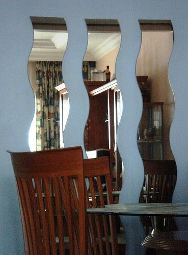
In the 80’s sectional mirrors were in style. 

3-mirrors.jpg

Nowadays, large framed mirrors are all the rage, but I think anything goes.  First of all select a mirror that fits your style.  Consider the style of the mirror with the style of your home, consider color of the frame, and the size of the mirror.  But most importantly consider what the mirror will refect once hung on the wall.  I think this is the biggest mistake people make when placing mirror(s) in their home.  You might also want to think about the principles of Feng Shui before you hang a mirror.

“Mirrors are used quite often in Feng Shui with INTENT. They can be a way to intentionally draw someone into a space—or  make them feel “pushed away.”  For example, we usually recommend placing a mirror if you have a small entrance-way, to “grace” someone into the space.  We also look for walls to hang mirrors where they reflect the outside.  “Letting the Outside IN” is a Feng Shui Principle to create the Yin/Yang of a space.  But every space is different and before hanging ANY mirrors, have someone hold them and see how they make you FEEL first.” 
“Mirrors also Intensify and Magnify anything they are reflecting.  If you hang a mirror and it’s reflecting a blank wall, you will double the energy of nothing.  Always check to see the ENERGY of what that mirror faces.  Some lovely artwork opposite a mirror is a wonderful addition…..some people want to intensify LIGHT as well.”  Source: Carol Feng Shui Long Island 

Jill Denton

Jill Denton ~ Changing Spaces

Paint Color Trends for 2008 – Benjamin Moore

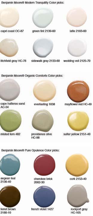
There are four categories of color trends this year from Benjamin Moore. Modern Tranquility,  Organic Comforts, Pure Opulence and Hot Colors for 2008.

Benjamin Moore paint color trends 08

Personally, I am drawn to the Mayflower Red, Misted Fern and Cork. Which would you choose?

 benjamin-moore-hot-colors-picks-for-2008.jpg

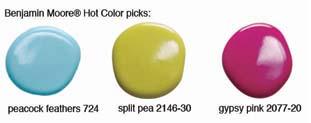
You may or may not be this daring, but here are all three hot colors together

paint color trends 2008

According to various sources, environmental and earth colors will continue to be popular paint color choices for homedecor and interior design in 2008. Popular color palettes will still include brown paints, green paints, and blue paints.

There is an “environmental” trend afoot, being propelled by global events including increased reports of global warming, water preservation, gas prices, an increase in the development of alternative energy sources, and manufacturing trend which is making more hybrid vehicles available to consumers. The environment is very much on our minds, and the colors that make up the environment are seeping into our interior home decor choices.

2008 Home Decor Paint Colors

2008 Home Decor Paint Color Palette: “Agrestic”

Forecast color palettes for 2008 home decor includes a contemporary take on rustic color and design. Look for deep, roasted browns, goldenrod yellows and energetic pinks, plus “tender greens,” like Mountain Sage from Behr paints.

Other colors that fit this 2008 color palette:

Estate Vineyard by Behr is a deep, burned red-infused brown.

Sunshine Yellow by Benjamin Moore is a bright yellow that fits with this 2008 paint palette.

2008 Home Decor Paint Color Palette: “Chinoiserie”

Any home decor inspired by “intricate patterns” and “elaborate decoration” that has been Chinese influences fits in this 2008 home decor color paint palette. This paint palette draws on mauves, and yellowish-greens, not the blue and white combination you may be picturing.

2008 Home Decor Paint Color Palette: “Ethnic Chic”

A global, international influence retains a tight hold on interiors in 2008. The internationally-inspired colors take the richness of Bollywood colors and tone them down slightly, with careful color complement selections.

For example, dark purples like Exotic Orchard by Behr continue to be popular, but are toned down somewhat when used with an earthy gray hue like Gray Mirage by Benjamin Moore.

Also think of pumpkin-infused color like Behr’s Spiced Pumpkin paired with a bright Toronto Blue paint by Benjamin Moore.

Jill Denton

jill.jpg

Contact me about getting a color consultation for your home.

Serving the San Francisco Bay Area.